Spent a weekend swatching - here are the results:
 |
| Left to right: Grape Parfait (TKB), Sagittaire (TKB), Blue-Red Chrome (CS), Pure Purple (TKB), Metallic Pixie Purple (CS), Lavender(Conservatorie), Bishops Violet (TKB), Grape (TKB) |
Swatches are dry over Manhattan's eyeshadow primer.

New ones amongst the purples are Coastal Scents' Blue-Red Chrome and Metallic Pixie Purple. Blue Red Chrome seems to be TKB's Ballad Blue but since do not have it, can't confirm. Description and swatches seem mighty alike though. Has a distinctive red sheen to it. Metallic Pixie Purple is just that - purple.
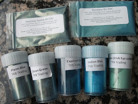
It gets more interesting with the blues, I could have sworn the Duochrome Sparkle BY226Y is a dupe for Pisces Blue - alas no. The latter has darker blue base. The intensity of the base actually reminded me of Capricorn Sea.
Duochrome BG826C is pretty Close to Indian Blue but it's less "blue", less opaque. It seems a tad greener too - I'd say if you have one, do not bother with getting the other. CS webpage suggests other wholesalers may sell the same color under the name of Coral Reef. M.K. commented on this post that it's not a dupe for TKB's Coral Reef but it could be Conservatories's (Conservatorie has messed up the pic for their Coral Reef pigment - it's orange there).
 |
| Top row: Duochrome Sparkle BY226Y (CS) and Duochrome BG826C (CS) Bottom row: Pisces Blue, Ocean Green, Capricorn Sea, Indian Blue, Lucky Green (all TKB) |
One thing I would like to know though - Why is it that these CS colors don't have names? They are so bloody difficult to remember this way...

Need kaks esimest, Metallic Pixie Purple ja Blue-Red Chrome on veidi õnnetud toonid: kumki pole mu jaoks eriti kantav. Esimene on suht igav tavaline lilla ning teine on veidi põnevam kuid siiski nagu sinikas.
Duochrome Sparkle sobiks mõnele diskotibile, efektne näki-meik, Duochrome BG meeldib neist neljast mulle endale kõige rohkem - kõige kantavam. Selle tooni muutumine kuldse, roheka ja sinaka vahel teeb ta kantavamaks kui seda oleks puhas sinine.
These are so pretty!!
ReplyDeleteToo bad I do not use them much :D. Pure Purple is the perfect bruise color on me, the only purple shown here that I could pull off is Sagittaire but that one has some serious adhesion problems.
ReplyDeleteBut I recommend warmly Duochrome BG, it's quite wearable thanks to it's shifting. :)